
Web users no longer have to sit at a desk to view your website
They use your website on their smartphone & tablet devices whilst on the move, or even when watching TV.
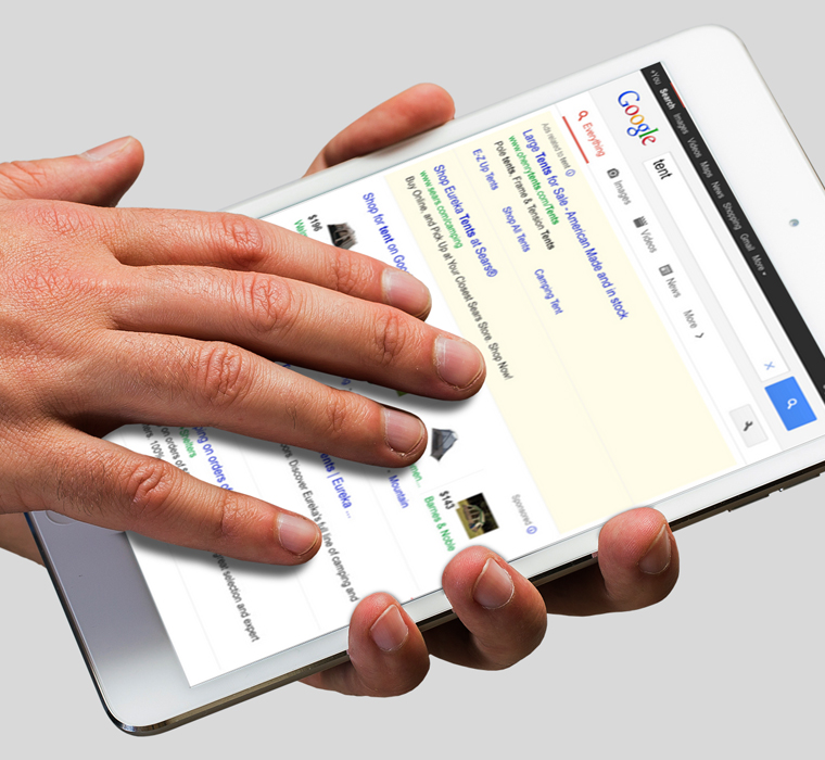
Furthermore, over 50 per cent of businesses use mobile devices to research business prospects and suppliers.
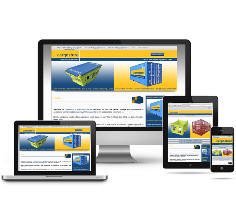
A mobile optimised, ‘responsive’ website will adapt to perfectly fit small screen sizes – improving the readability of text, and making navigation a breeze.


The best user experience
We optimise all aspects of the web experience – fonts sizes are increased for superior readability, menus are touch-responsive for easy navigation, slideshows can be swiped, and much more…
Optimised for a wide range of devices
We can integrate mobile optimisation into your website design, or optimise your existing website, ensuring compatibility with all major devices currently on the market – including Android and Apple iOS devices.
Benefits for your business
Having a website that is optimised for mobile devices makes for a pleasing user experience. Visitors are more likely to get in touch or buy your product if they find the experience enjoyable and easy to use.
Get the edge over the competition
Google is now giving preference to mobile optimised websites in its search results, so with additional benefits to your search engine rankings, there has never been a better time to go mobile!
Don’t get left behind…
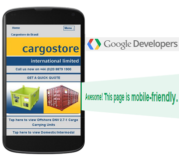
Google Approved
Our mobile optimised websites pass Google’s Mobile-Friendly Test, which rewards websites that have been designed with the mobile user in mind.
This means our designs meet the criteria for optimal font size, link spacing, and page sizing.
We’re here to help!
Whether you’re a new business looking to develop a mobile optimised web presence, or an established business with an existing website in need of a mobile upgrade, we can provide a complementary responsive solution.